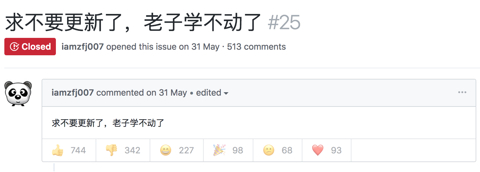
关于学不动
你好,2019
不用软件让 MacOS 自动清理内存
自建轮子之 Stencil Web Component
CRH&NB前端分享
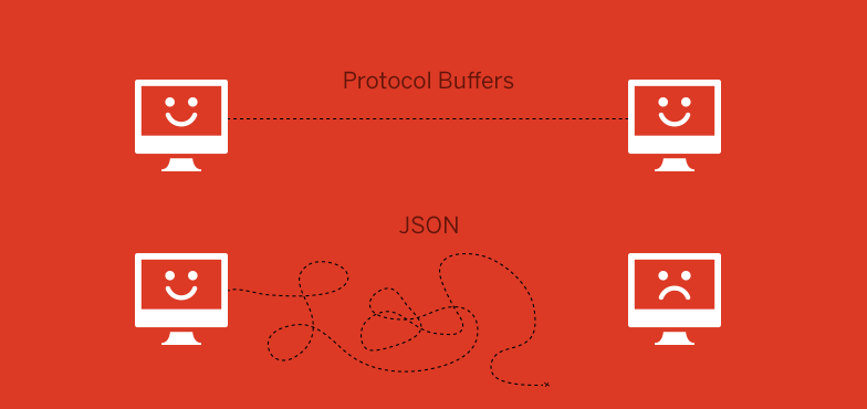
避免图形文件过量
Ron King
When designing a website, it’s easy to start loading it up with graphics. While tempting, you have to resist – otherwise, you’ll end up with graphical overload.
当设计一个网站时,一般都会很喜欢先装载图形文件。当你尝试这样做的时候,你必须先忍耐,否则的话,你就应该马上终止使用过量的图形文件。
Why is that a bad thing? Here’s why.
为什么不要过量使用图形文件?下面就是原因所在。
It Takes Too Long to Download
导致下载时间过长
The first reason to cut down on graphics is that the more there are, and the larger they are, the longer it will take each of your pages to download. People are impatient when waiting for pages to download – you only have around 5 seconds before your visitor hits the Back button.
避免使用过多的图形文件的第一点原因就是:如果图形文件过多,或过于庞大,那么每张页面的加载事件就会越长。人们没有那么多的耐心等待页面加载,他们一般等待5秒钟以后便会点击返回按钮。
What can you do about this? Apart from using fewer pictures, you can also make sure that you resize your images in a graphics editor. This actually makes their file sizes smaller. If you just resize images by specifying a width and height in HTML or CSS, they will still be slow to download because the full file size is being used.
那么针对这点,你可以做些什么呢?除了使用更少的图形文件外,你还可以使用图形编辑器重新调整你的图形大小。这样做可以真正地减少图形文件的尺寸。如果你仅是通过使用HTML和CSS来指定图片的宽度和高度,那么图片下载起来还是会很慢的,因为图片的实际大小并没有更改。
You should consider turning on compression in your image editor. JPEG files can often be compressed by up to 25% before there’s a noticeable difference in quality. Try different formats and compression levels to see what works.
你应该考虑使用图形编辑器来压缩你的图形文件。JPEG文件可以将图形文件压缩到25%而保证一个极低的失真度。你应该尝试使用不同的格式和压缩水平来测试实际效果。
It Gets Too Busy
它会使整个站点的工作变得更加繁忙
If you use a site with more than 4 images on the page at once, your eyes are being pulled all over the page. They’re not sure where to focus because the page simply has too much going on.
如果一旦你在一张页面上使用超过4张图片,那么你会感到眼花缭乱。能不能确定该集中观察哪些地方,因为页面上有太多的东西了。
Look at the front pages of newspapers, and notice how they lead on 1 picture. Putting 2 pictures on a front page is considered to be poor: the reader doesn’t know where to look.
看看报纸的头版,看看他们是怎样放置着一张图片的。在首页放置两张图片可能就会带来麻烦:阅读者会弄不清楚到底该从何处阅读。
That goes double for websites, where the viewable area is much smaller than a newspaper page. Even if you have more than 1 thing to say, it’s better to ‘go large’ with 1 picture and then explain the other things in text, next to or below it.
相对于报纸来讲,网站的可视化区域就更加稀少了。即使你要表达的事物不止一件,那么你也最好只放置一张图片,然后在这张图片的旁边或者下方用文字来补充说明。
It Distracts from the Content
不能使阅读者专注于阅读文本内容
Users visit your site to get information, not to look at your graphics. Too many graphics will distract from your content, or, worse, force readers to search for it. Any time your graphics get in the way of people readily using your site, you’re suffering from graphical overload. And that is a bad thing.
用户访问站点的目的是获取信息,而不是查找图片。过多的图片会分散他们阅读文本内容的注意力;或者,更糟的是,会使得用户对站点信息无从查询。任何时候,当你放置的图片阻碍了用户对你站点的正常使用,那么,你的站点就面临了图片过量的境地。这并不是一件好事情。
What’s the solution? Simply decide which of all those graphics are really necessary. Remember, don’t add graphics just to look nice, each graphic must have a specific purpose.
那么,解决方案是什么呢?先简单地看看,所有这些图形是否是必须的。请记住,不要为了网站的美观而肆意添置图片。放置的每张图片都应该能够物尽其用。
An Exception: Photo Galleries
这里有一个例外:相册
If the purpose of your site is photo presentation, then clearly multiple images are appropriate. However, don’t just stick up several large photographs – provide thumbnails: smaller versions of each image. If interested, the visitor can click on 1 to make it larger.
如果你的站点纯粹是一个与相册相关的站点,那么清楚地放置各类图片是合适的。然而,不要专注于放置那些过大的照片图片,尽可能地放置那些精致的小图片:先放置小图片,如果访问者兴趣的话,可以点击这张小图片来显示对应的大图。
This fits more pictures on each page, and avoids wasting user download time and your bandwidth.
使用这个方法可以在每张页面上放置数量庞大的图片集,同时也不会浪费用户的下载时间和你的网站带宽。
Keep in mind that in all web design, the images are there strictly to support the content. Even when the content is graphical.
请永远地记住,在你所进行的所有网页设计中,放置的图片一定要严格支持内容。即使整个网站的内容是以图片宣传为主的。
重新改造你的主页
Everyone struggles to make their sites appealing. Nonetheless, only a few has discovered the formula behind pretty and serviceable site.
每个人都想把自己的主页制作得更吸引人一点,即便如此,仅有少数人找到了制作美观站点和对人们有帮助的站点的诀窍。
Some sites need little alterations but some need total overhauling. The latter, being the most taxing than the former, has to start off on the right foot. What does it take to have tempting and pleasurable sites?
有些网站需要做出细微修改,而有些网站就需要整体改版。如果到以后修改的话,会变得比以前更复杂,就必须要从右脚边开始。那么要制作吸引人的和令人愉悦的站点需要做好哪几点呢?
First, a site must have focus or concentration leading to a goal. Be sure not to leave the site wanting in details. Say everything that needs to be said. The contents must be material to the site’s objectives. Place in graphics that are valuable to the site. Bear in mind that the color, design and layout must agree to what you are saying. However, do not give beyond what is expected.
首先,网站必须存在目标和主题。确保不要过多地描述与网站主题不相符合的内容。说那些应该说的东西。网站的材料必须为站点目标服务,防止的图形文件也应如此。必须留意颜色因素,确保它的设计和布局符合网站的主旨。不要放置那些与预期不相符合的内容。
Focus means organization of ideas and graphics. The more organized the homepage is, the better.
专注于防置那些与站点主题相关的概念和图形。在首页上放置的越多越好。
Another attribute of a good homepage is empathy. Marketing involves not just logic but a greater doze of matters of the heart. Persuasion is the key to a successful marketing strategy thus, this is also vital in websites most especially to homepages since they are primarily used to market products and services.
另一个较好的首页特征就是能够引人入胜。销售不仅逻辑性要强,而且更重要的一点还要能够打动人心。尽管说服力是进行成功行销战略的关键一点,然而,首页也至关重要,因为他是直接进行网络产品和服务行销的门面。
When visitors come to a certain site, their expectation is to be served and get solutions or answers. Therefore, your site must cater to the individual needs of these visitors. That way they can be satisfied and comfortable with your site. This will further build trust and loyalty between visitors and your site. This trust can yield you visitors and probable purchasers.
当访问者进入一个特定的站点后,他们所期待的就是能够得到帮助或得到解决方法和答案。因此,网站所提供的内容必须能够满足访问者的这种需要。那么,你的网站就会博得访问者的喜爱,满意度自然也会很高。此举可以提高访问者与你的网站之间的信赖度和忠诚度。这种忠诚度很可能将你的访问者转变为直接消费者。
To empathize, you have to know first the possible reasons why visitors come to your site. Next, the class of visitors and level of knowledge they have in connection to your product and services. Be sure to answer all the doubts in their minds as well as needs, feelings and habits because that will affect the decisions they will be making.
同样的,首先,你必须知道访问者能够访问你的网站所可能的原因;接下来,你要直接你的产品应该和怎么类型的人或怎样知识层面的人相结合。尽可能地回答他们所提出的所有疑问以及满足他们的需求、感觉和爱好,因为这些将对他们的最终决定起到至关重要的作用。
The third thing to consider - is the ‘call to action’. This is the most important yet the most neglected attribute of a site. Without this, your site will be wasted.
第三个要考虑的问题就是:行动流程。这是至关重要的,但也是最容易被人们忽视的网站特征。如果没有这点,那么你的网站将没有任何价值。
Visitors want to know the action plan and they should get what they are supposed to do. The action plan can be getting information, buying the product, signing up for a service and the likes. Give a strong, persuasive and clear action plan to get the results you desire.
访问者都希望知道行动流程,他们希望知道他们到底该怎样去做。行动计划可以包括获取信息、购买产品、预订服务和他们喜欢的东西。那么,你应该为访问者提供一个明晰有效行动计划来达到你所期望的结果。
Reinvent and invigorate you homepage by making it stunning and functional!
那么,最后就将网站改版成更加吸引人和功能性更强的站点来创建和改进你的主页吧!
无线鼠标,进度条。。
今天生日的同座姐姐说很想要无线鼠标,但感觉鼠标没了线就好比老鼠没了尾巴一样。。。
当然了,如果没人买,弟弟我愿意效劳。。
同座其实就是一个星座。。
姐姐其实也就大了没几天。。
进度条从0%到100%
很多事,很多人,喜欢讲进度
有些事99%和0%是没有区别的。。比如安装程序。。
但还有一些事0%和1%都有本质的区别。。比如投篮命中率。。你不出手命中率永远是0%
说那么多袄口的话还真不是我的风格。。
所以说,自然平静才是真么。。我还是会坚持下去的
不然就不能和姐姐同座了。。
虽然人家说我不像。。。
网站不应该是娱乐为王
不能否认的是现在上网的人大部分还是属于娱乐一族的。
但相信当初发明网络的牛人最初的目的绝对不是这个。。网站作为网络上集中资源并作为展示的平台,应该体现出它们各自的资源价值。
所以做网站有几个基本的原则,遵循它不光现在不会被人遗忘,将来也不会。。
- 重中之重的唯一性
这个也可以说是原创性,这个好处不用多说了。。
- 完整性
任何人都不喜欢在经过search的磨难后还要遭受虎头蛇尾的结局。简单说,你想阐述什么,请一次性阐述清楚。。不要无限制的(待续)
- 细节人性化
做站不是容易的事,如果谁说很容易,那么可以确定的是他不是那种喜欢思考问题到每根发端的人。很多网站可以说出发点,内容,技术都不差,但收到的效果却不理想。这时候可以考虑下是不是细节上出了小差错。
- 针对性
网站你可以做的很丰富,但丰富并不意味着绝对的优势。丰富需要维护的也就更具挑战,维护起来的难度也就越大,你的用户定位就会越困难。所以,在没有肯定你在那方面有优势的情况下不要随便丰富网站的内容
- 让它有意义
一个简短的寓言,真因为它有很不简单的道理才会被人铭记。网站也可以借鉴
上面这些不光适合个人站,也适合大的站点。。
以上为本人拙见